Case Study 2:
Evaluative

Background

As Senior UX Researcher at RentSpree, a real estate technology startup with 180 employees, I spent around a year as Research Lead for our Landlord Tools team. Our team’s biggest product was a rent payment product–one of RentSpree’s two most important products–and it was still fairly new. When I joined this product team, traffic was low and retention wasn’t great.

Our product roadmap had plenty of items on it because I had already analyzed user feedback and past research insights to deliver recommendations for table stakes features that were missing from the product. I would soon after provide our team with research insights that led us in creating a product-led growth roadmap to increase acquisition.

Yet, expectations were high. Leadership viewed this product as the one that would determine if our mid-stage startup would reach IPO or not. We needed quick wins.

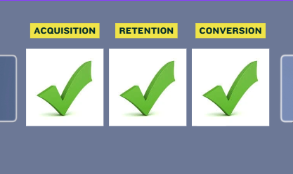
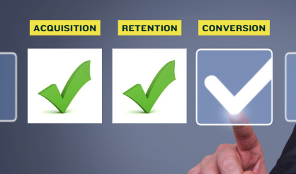
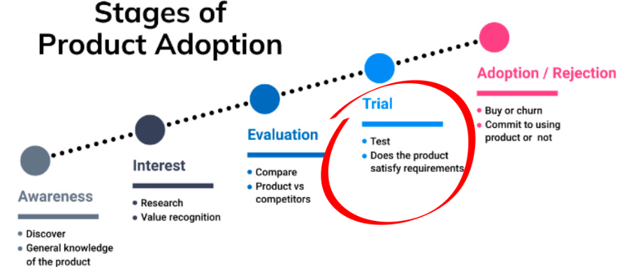
The product manager, designer, and I agreed that we should focus on improving conversion since I had already helped us establish plans for improving retention and acquisition. Our rent payment flywheel worked by landlords inviting their tenants to use the product. If we optimized the product onboarding process for landlords, many tenants would follow. Our product-led growth roadmap already included some of my ideas for enabling tenants to invite their landlords to the product, but one step at a time. Right now, I was on a mission to maximize the traffic we already had by making landlord onboarding easier than ever.

Conversion To Do
Unknown Knowns

I knew that we needed a quick turnaround and already had an abundance of under-analyzed data. So, I decided to forgo talking with users for now and instead conduct an evaluative study that would leverage the quantitative and qualitative data that we already had: platform analytics and user session clips. I would also evaluate copy and design elements to identify quick wins. So, I created a research plan in Notion, asked my team for feedback, and got to work.

The Process

I began this study by testing a team assumption. Several months before I joined the team, they had moved a crucial part of the workflow to earlier in the process. Initially, landlords could enter tenant and property information into the system and see their financial ledger before completing the onerous process of connecting their bank account and verifying their identity (IDV), a process that required entering tax information, taking a selfie with their driver’s license, and allowing RentSpree to connect to their bank account. Now, landlords needed to do these things at the beginning of setup.

The product manager had seen that landlord conversion had dropped from 23.4% to 16.5% since the team made this change. He boldly proclaimed “conversion is down!” Yes, 16.5% is lower than 23.4%, but was this difference statistically significant? After all, it might be due to random chance rather than any real world phenomenon.

So, I ran a quick statistical test in Python (Two Proportion Z-Test). The result: Unlikely random chance! It turns out that landlords were now ~30% less likely to complete product onboarding compared with the old design. But it never hurts to check, right?

Z Test
Deduction

My approach to this study was to move from the broad to the specific. I would start by using quantitative methods to identify the most problematic webpages and steps in the workflow through funnel analysis as well as where on these “problem pages” users were having trouble through analyzing heatmaps and form field data. Finally, I would do qualitative work by watching user session clips to uncover specific details about design interaction and user behavior to understand exactly what problems were occurring and why. This mixed methods approach would create richer insights than using qualitative or quantitative methods alone.

Evaluating funnel analytics in Amplitude and cross referencing with Holistics data, I saw that drop off was highest during the IDV process.

But, could the drop off just as easily have happened at a different point in the funnel? In other words, was the high drop off rate during IDV (rather than at some other point) due to random fluctuations in user behavior or was the IDV process the cause?

I ran a Chi Squared Test in Python. The result: Unlikely to be random!

Chi Squared Test
Run a quick Chi Squared Test in Python to determine if your data is as expected or something is going on
amplitude

So, I knew that the IDV process was likely causing drop off, but why were users dropping off? I decided to compare IDV conversion rates for the current and old flows.

Interestingly, users were equally likely to start IDV regardless of flow order. In the old flow, 38.2% of users on the feature landing page began the IDV process. This number “jumped” to 40.9% for the current flow, but this difference was not statistically significant. Imagine the misjudgment that would have occurred if someone saw those numbers and didn’t check for statistical significance!

Yet, in the current flow, users were far less likely to finish the IDV process. Therefore, it appeared that the placement of IDV in the flow was impacting conversion.

IDV Success
Product Adoption

My hypothesis was that the most demanding, intrusive parts of the onboarding process (identify verification and bank account linking) were too cumbersome and occurred too early in the onboarding process.

I knew that other things needed to happen first in the product adoption process and believed the key was to provide users with opportunities to trial the product so they could get to that “Aha moment”–that instant where the user realizes that the product solves their problem–before we ask them to complete sensitive, higher effort tasks.

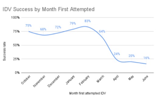
“Placement buried the Aha Moment!”

But who was the placement issue impacting?

I segmented platform data to see if factors like type of device, type of user (eg, landlord versus property manager), or type of concern (FAQs clicked) impacted conversion rate?

I found no statistically meaningful correlation.

FAQs
Form Fields

I also conducted a “form data analysis,” where I looked at the rate of successful entry for all form fields in the IDV process. Since much of the IDV process happened through the Stripe API rather than on the RentSpree domain, we didn’t have analytics data or user session clips for this part of the flow.

Luckily, I was able to poke a hole in this “data blindspot” by accessing the limited analytics that Stripe provides to customers on their platform, analyzing the data that our users entered into form fields, revealing user challenges as well as opportunities to remove fields and improve copy.

Finally, I conducted activities to identify granular details and uncover user motivations. I shared early insights with my customer operations colleague and checked support tickets and user feedback for relevant data, but didn’t find much.

Yet, when I conducted a UX heuristics evaluation, I identified several breaches of best practices and a bunch of “quick wins.” Still, I wanted to cross-reference these theoretical issues with real world quantitative data. So, I looked at LuckyOrange heatmaps to help me understand how common it was to click on particular elements and areas of the page.

However, clicks and scrolls aren’t the only types of user behaviors. So, I watched countless user sessions in LuckyOrange and input my observations into a synthesis matrix in Excel to identify patterns. Nothing can replace asking users why they did something–a method that isn’t without its flaws–but observing sessions can lead to some pretty strong theories regarding user motivations.

Heat map
Watching user sessions and studying heatmaps should be an ongoing practice

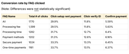
“Clicks and scrolls aren’t the only types of user behaviors.”

Deliverables

I created a research report to communicate my findings, which included a database of 36 recommendations for improving the landlord onboarding experience. I shared the report in Slack channels, promoted it in cross-functional team meetings, and set up a remote research sharing session with my team.

Open Sharing
Example of a Figjam I used for an open sharing session

Sometimes, my study will yield insights that apply to stakeholders across several teams and functions. In those cases, I may start by hosting what I call an “open sharing session,” where I invite a large and diverse group (in several cases, it’s been the whole company) with the goals of education and inspiration. To accomplish this, I explain the widely relevant insights, address questions, help participants identify potential actions to take, and try to secure commitments from individuals to take the ball and run with it.

Conversely, I’ve also facilitated an open sharing session that was exclusive to our team of 10 designers, where I went deeper into the particulars of user needs and led them in exploring how the insights may apply to the design process.

If insights apply to another researcher’s team, I always reach out to that researcher to discuss the relevant insights and make sure they’re ready to bring them to their team. I’ve been known to do guest appearances to support a fellow researcher and their team, explaining relevant insights from my research and how they might apply to their work.

I only needed to host a single sharing session for this study since insights primarily applied to my immediate team. However, for studies with broadly applicable insights, I tend to host multiple sharing sessions (my record is 5!).

The type of session that I used for this project was a “working group session.” I reserve this type of session for individual product teams; usually my own product team but occasionally a different team that I have insights for. I also invite the VP of Product and Chief Experience Officer to help us remain aligned on priorities and ensure that leadership decisions are based on the latest insights.

In working group sessions, I provide the remote team with a FigJam board for us to work in. I start by outlining the goals of the session and briefly introducing the study. Then, I explain the top 3-4 insights and core recommendations. Participants can click on any insight or recommendation in the FigJam, which takes them to the relevant section of the report where they can access details, explanations, and data visualization. Throughout the sharing session, team members are invited to chime in or write their questions or comments on sticky notes for me to address during the session.

Next, I answer questions, bringing second-tier insights and recommendations into the discussion when relevant. Researchers, don’t get attached to explaining every one of your precious insights! Education is not the destination. It’s just the vehicle that gets you there. Your primary goal should be to catalyze action. You can focus on the lower-tiered insights later. After all, insights education is an ongoing process.

Facilitating collaborative ideation is a big part of the working group session and I always followed up ideation with dedicated time for the team to formulate action items. Securing commitments to action is essential.

Working Group
Inclusion

I try to make research sessions inclusive by providing various ways for people to share their thoughts and questions. This includes providing 5-10 minutes of silent time for adding your ideas as sticky notes before we work together to thematically group ideas and discuss. I’m also a bit obsessed with ideation frameworks. I’ve facilitated teams in using a bunch of them: eg, SCAMPER, Amazon Working Backwards, How-Now-Wow, Crazy 8’s, Lean Coffee, Six Thinking Hats, etc.

Inclusive techniques can empower neurodivergent and other colleagues. At RentSpree, inclusivity proved especially valuable, as two-thirds of our employees were Thai and many were not native-level speakers. Because I had lived in Japan, I had lots of experience interacting with non-native level English speakers. Additionally, I understood what it was like for them because I had first-hand experience. Navigating complex group conversations in Japanese wasn’t easy for me! So, I knew how to modify my speech and structure sessions to facilitate a more inclusive environment.

As an additional measure, I always encourage colleagues to contact me anytime to discuss research on a one-on-one call or through Slack messaging.

A designer once made my month by messaging me to say that several of her Thai colleagues remarked on how thankful they were for how I tailored sessions to their needs. It was amazing!

Research Findings

We learned a lot of things from this study.

Firstly, many of our hypotheses were correct. Conversion had gone down significantly since the change in design and moving the placement of IDV was likely a key factor.

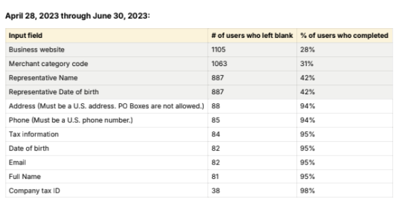
My core belief was that we needed to help the user get to their Aha moment faster. Moreover, beyond moving IDV placement, we needed to simplify the IDV experience. We were asking a heck of a lot from these landlords who hadn’t even used our product yet. Luckily, I had identified 36 improvements we could make to the onboarding experience, from changing the workflow to removing data blindspots to improving design, copy, and transactional emails.

Aha!
Impact

Cut Setup Time in Half!

Improved Conversion

Improved Usability and Satisfaction (UMUX-L Score)

No Impact on Fraud Rate

Removed Data Blind Spots

Got Landing Page Redesign Added to Roadmap

Design Thinking

Our team agreed to redesign the landlord onboarding experience and apply a number of my recommendations immediately. So, once we aligned with the Director of Product and product manager on the scope of the changes, the designer and I worked together to design the prototype. This would include moving the IDV process completely onto the RentSpree domain to give us complete control over design and remove the data blindspots that came with using the Stripe API for part of the IDV process. Once the designer and I were happy with the prototype, we shared it with the product and engineering managers for feedback.

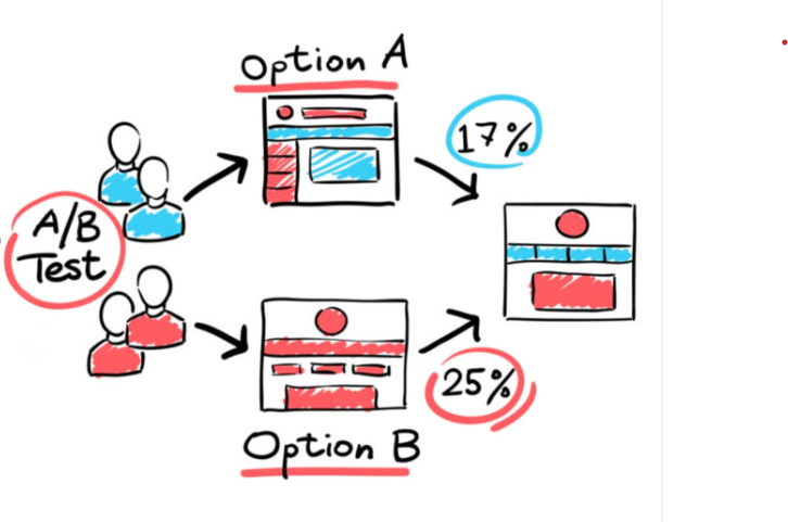
I worked with a data scientist to design an A/B test to evaluate the performance of the prototype against the design in production. Our data scientists liked to be involved in A/B testing, which was fine with me, as it’s always nice to have another person to think things through with. None of the other researchers or PMs at RentSpree had the statistical background to do that with me.

We ran a Z-Test for Proportions to determine the amount of traffic needed to reach a statistically significant difference, but the necessary sample size was too high. So, we reduced the “power score,” which meant our level of confidence in the result would be a bit lower but statistical significance would be achievable.

We tested for changes in two metrics:

  1. Conversion rate
  2. Time to completion

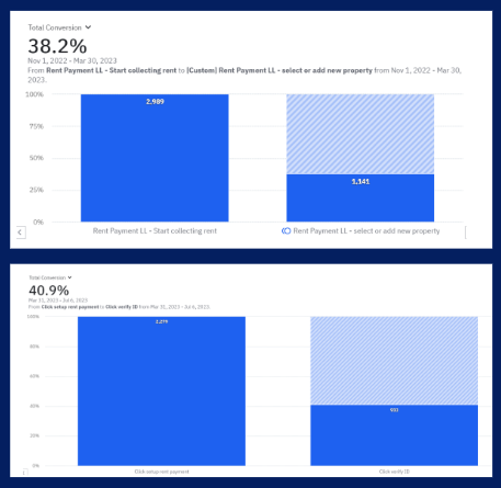
A Z-Test for Proportions revealed a statistically significant increase in conversion rate and a T-Test revealed a statistically significant decrease in time to completion. A/B testing successfully demonstrated the positive impact of my research recommendations!

A-B Test
Checklist Complete

This study was quite successful. Within just a few weeks, I had produced insights and recommendations that were immediately actionable. We quickly rallied around the study’s core conclusions, aligned on an action plan, created a prototype, ran an A/B test with excellent results, and compelled the marketing team to add a redesign of the landing page as a shared roadmap item. We had accomplished our goal of increasing conversion, improving usability and satisfaction in the process.

To make sure we continued in the right direction, I designed an in-product survey through Survicate to ask non-converting users why they didn't complete product setup. So, this was just the beginning.